

Therapy Website Project
My Role
UX Research, UX/ UI Design
October 2025 - ongoing
Project Scope
End-to-end UX design project for a responsive website
Overview
A business website for an independent therapist, Laura Adlam, designed to help current and potential clients access information about therapy services, understand what to expect, find supportive resources, and contact Laura easily to book a session.
The Problem
Although the website felt calm and well intentioned, it was not effectively supporting new client acquisition. Following a recent rebrand, Laura was not receiving enough enquiries or bookings through the website. Users who visited the site often struggled to find key information, understand services quickly, or feel confident taking the next step to make contact.
This resulted in missed opportunities where potential clients felt reassured by the tone but did not convert into enquiries.
Original Website
Goal
Design a therapy website that reduces friction for emotionally sensitive users while clearly guiding them toward contacting Laura to book a session, without introducing pressure or sales-driven patterns.
Understanding the User
Research Goal
To understand how users experience Laura’s website when seeking therapy support, including where they feel reassured, confused, overwhelmed, or unsure about what to do next.
Research aimed to understand not only how users felt while browsing the site, but why reassurance alone was not translating into enquiries or bookings.
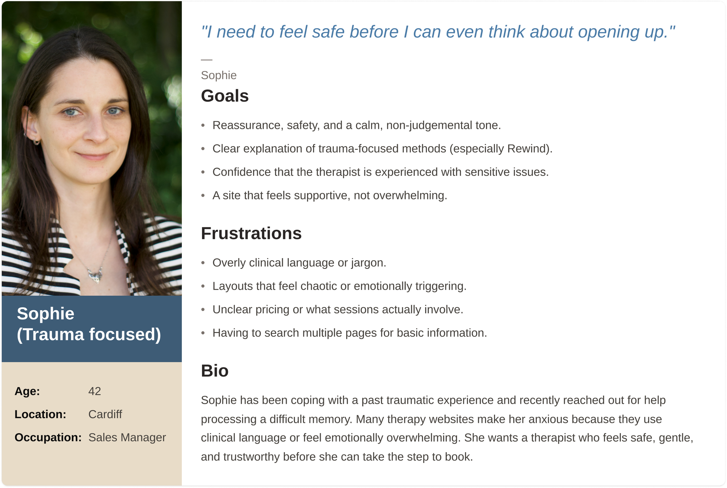
Group #1: Trauma-focused user
Seeks reassurance, safety, and a gentle, trustworthy experience when exploring therapy.
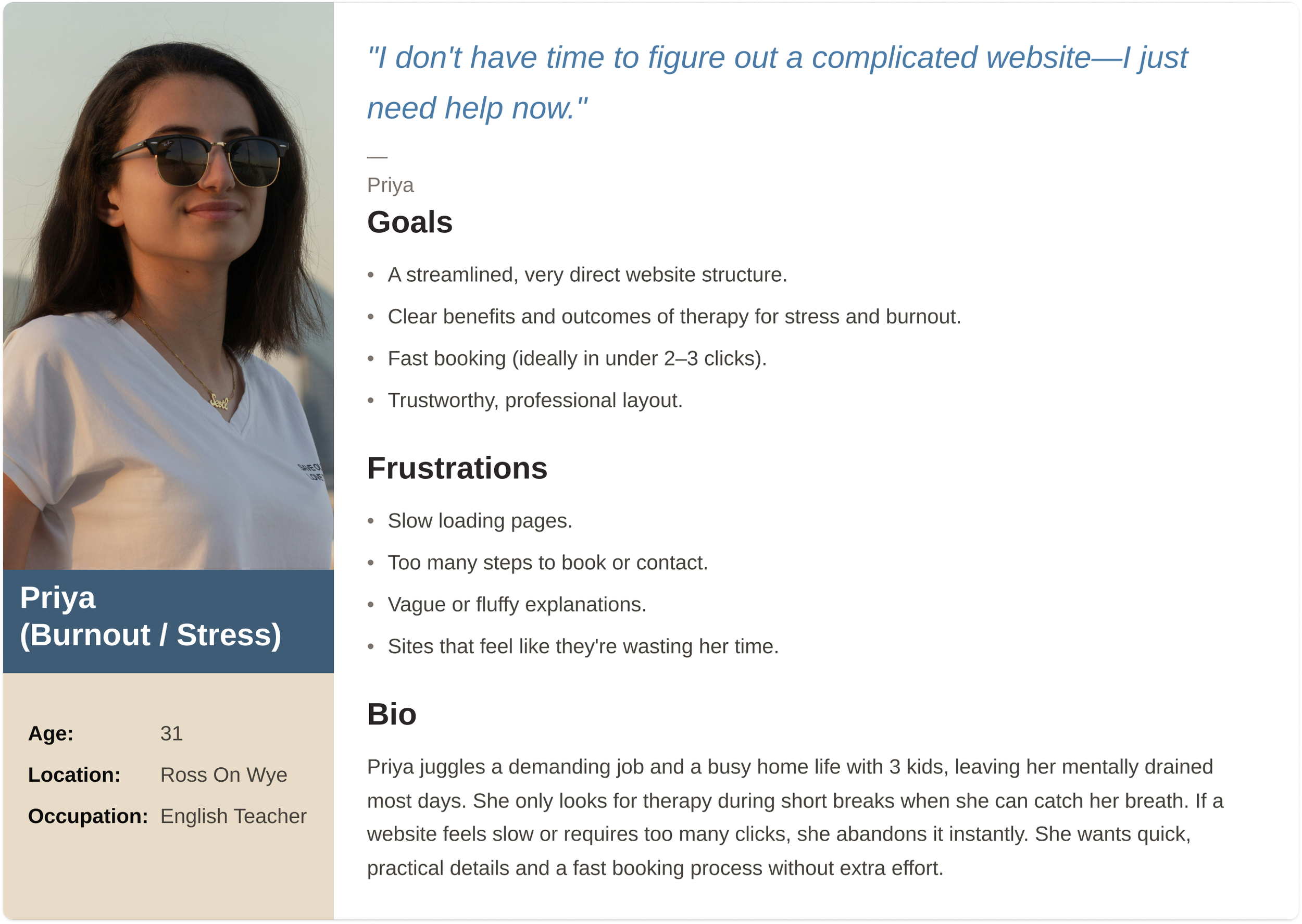
Group #2: Burnout/stress use
Wants practical, results-driven guidance with a fast and straightforward booking process.
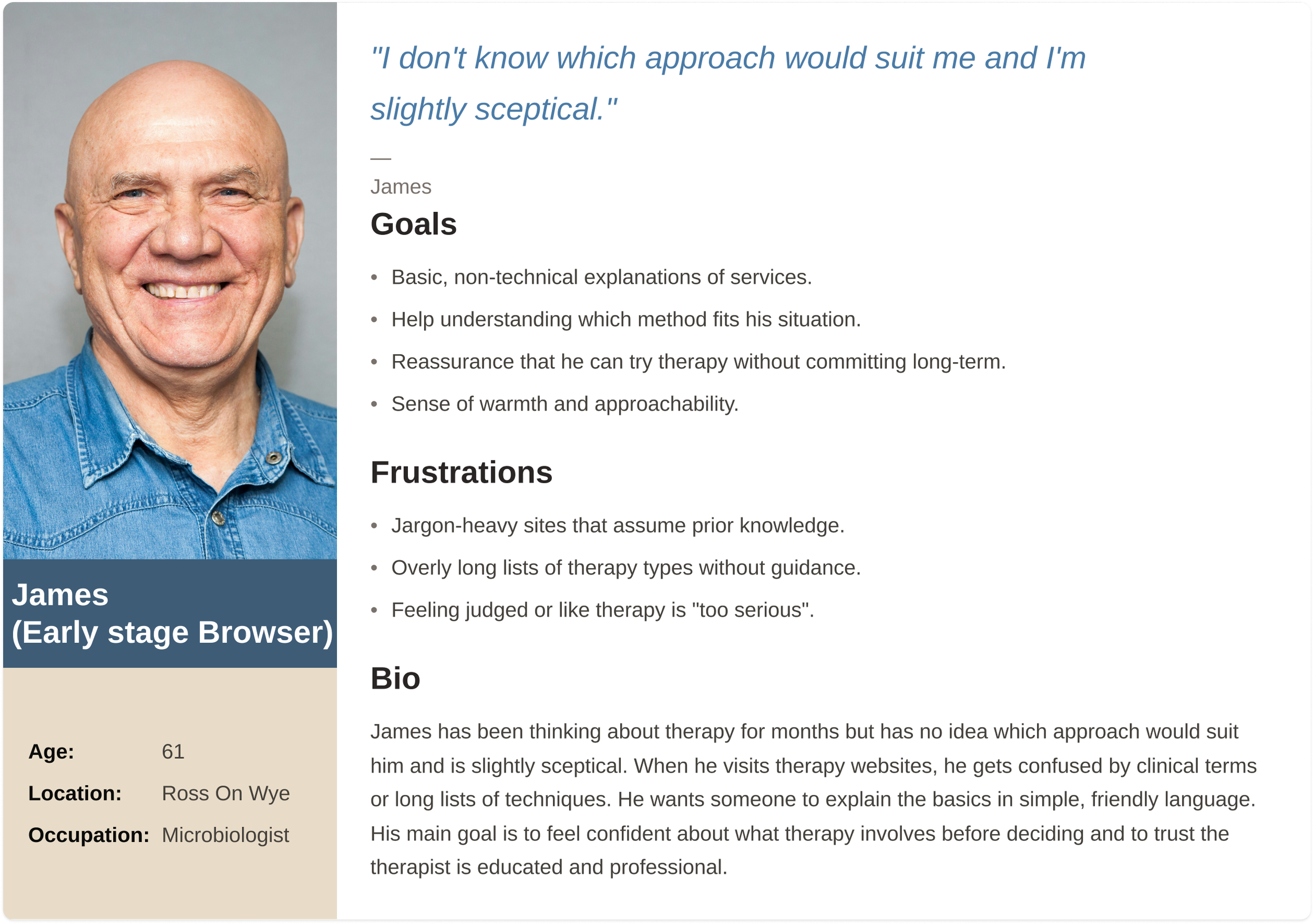
Group #3: Early-stage browser
Needs clear explanations and reassurance while exploring therapy options.
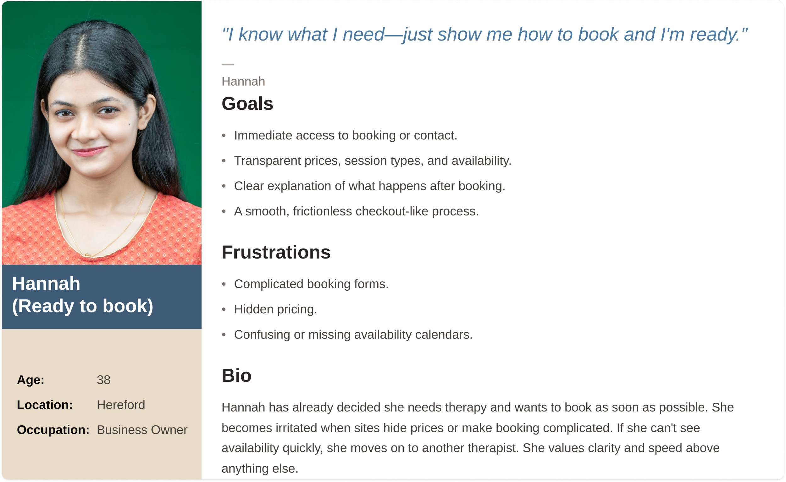
Group #4: Ready-to-book user
Looks for quick access to pricing, availability, and an easy booking journey.
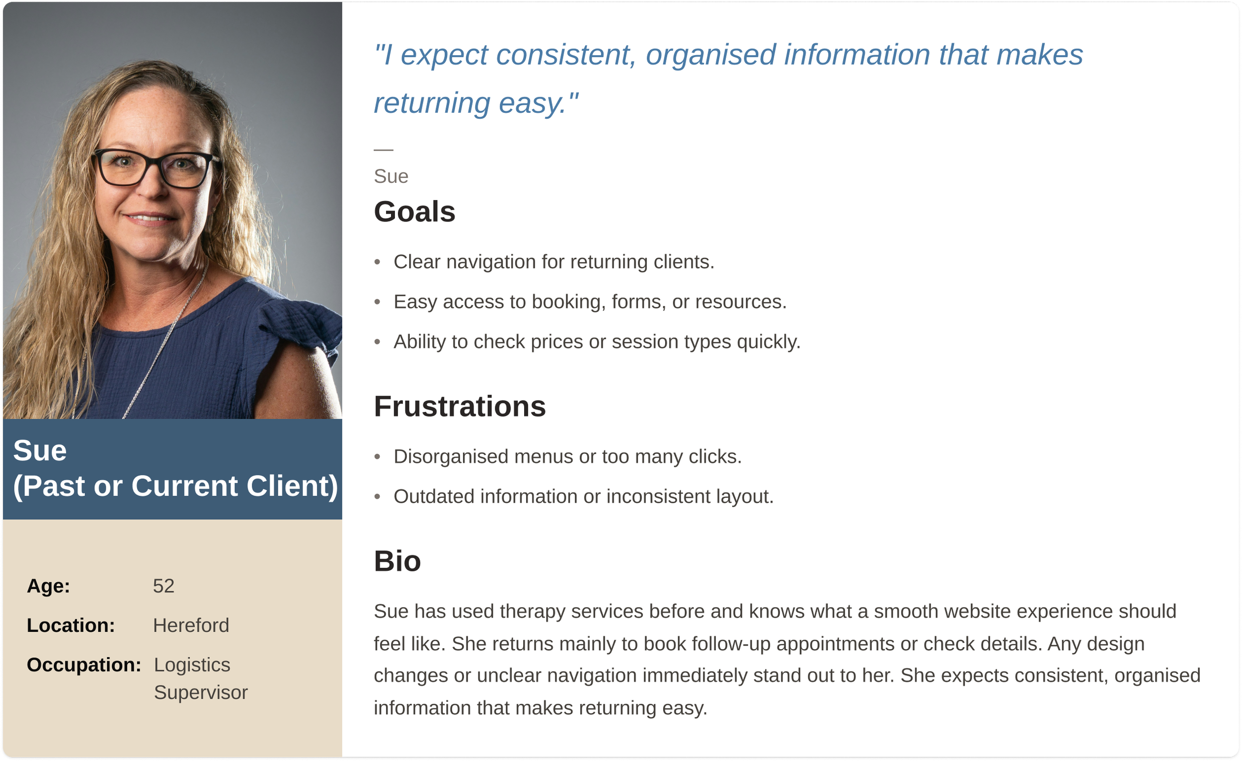
Group #5: Past/current client
Provides feedback based on previous therapy website experiences and usability insights.
Research Findings
I conducted qualitative interviews and a usability survey with participants representing different therapy-seeking stages. While users generally described the site as calm and easy to navigate, research revealed consistent challenges around information clarity, trust signals, and booking confidence.
“The amount of text stressed me out a bit. So much to read!”
- Client
“You can’t click on the icons for services or costs etc which is what people tend to do.”
- Client
“The colours are calm and the photos are soothing, but the amount of text stressed me out.”
- Client
“I couldn’t work out pricing for face-to-face sessions.”
- Potential Client
User Groups Identified
Research identified several overlapping user needs rather than rigid personas.
Some users were seeking trauma-informed support and prioritised safety, reassurance, and trust.
Others experienced anxiety or overthinking and felt overwhelmed by long paragraphs or too many options.
Users experiencing burnout valued direct explanations and minimal steps.
Early-stage browsers needed clear, non-technical guidance before committing.
Ready-to-book users wanted fast access to pricing, availability, and contact details. Past or current clients highlighted friction based on real booking experiences.
Readability:
Text length causes stress and overwhelm
Navigation expectations:
Icons are clickable
Pricing clarity:
Face to face pricing is unclear
User Personas
Research Insights
Even small moments of friction disrupted trust and confidence during a highly sensitive decision-making process.
What Worked
Most users found the website visually calm and generally easy to navigate
The tone felt supportive and non-clinical
Users felt reassured by the overall presentation
Where Users Struggled
Important elements such as images and icons did not behave as expected
Pricing information was unclear or difficult to find
Text stretched too widely across the screen, making reading tiring
There was no built-in booking or contact flow beyond static details
Users wanted stronger personal cues such as photos of Laura or the therapy space
Service information required too much scrolling and effort to digest
Pain Points
Users expected interactive elements to be clickable but they were not.
Wide and long text layouts increased cognitive load.
Limited personal visuals reduced emotional connection.
Pricing lacked clarity, especially for face-to-face sessions
The absence of an embedded contact or booking flow added friction.
Service information was not structured for quick scanning.
Ideation
Affinity mapping revealed that the primary issue was not missing information, but how and when information was presented. The design needed to reduce cognitive effort while reinforcing emotional safety.
This led to clearer content hierarchy, improved readability, visible pricing, interactive service elements, and a simplified contact experience.
Reading & accessibility
Navigation and interaction
Poor contrast causes eye strain and abandonment
Users expect booking CTA in top-right
Small text sizes deter users over 50
Unclear menus lead to immediate exits
Mobile tap targets often too small
Long paragraphs overwhelm stressed users
Mobile readability critical for on-the-go browsing
More than 2 clicks to key info causes drop-off
Users compare therapists based on transparent costs
Simple contact options preferred (phone/email)
Trust and emotional reassurance
Opportunities for improvement
Warm, accessible tone preferred over clinical jargon
Simplify booking to 1–2 steps maximum
Generic stock images reduce credibility
Display pricing clearly on homepage
First-time seekers need extra reassurance
Add visual hierarchy with better spacing
Booking and contact expectations
Pricing and service clarity
Lengthy forms deter anxious first-time users
Hidden pricing is top reason users leave
Unclear session details reduce trust
Availability visibility needed before enquiry
Multi-step processes abandoned on mobile
Qualifications must be visible upfront
Increase font sizes across all breakpoints
User Journey Mapping
A simplified journey map highlighted key moments where users hesitated, particularly when trying to understand services, pricing, and how to make contact.
These insights informed the structure and sequencing of content across the site.
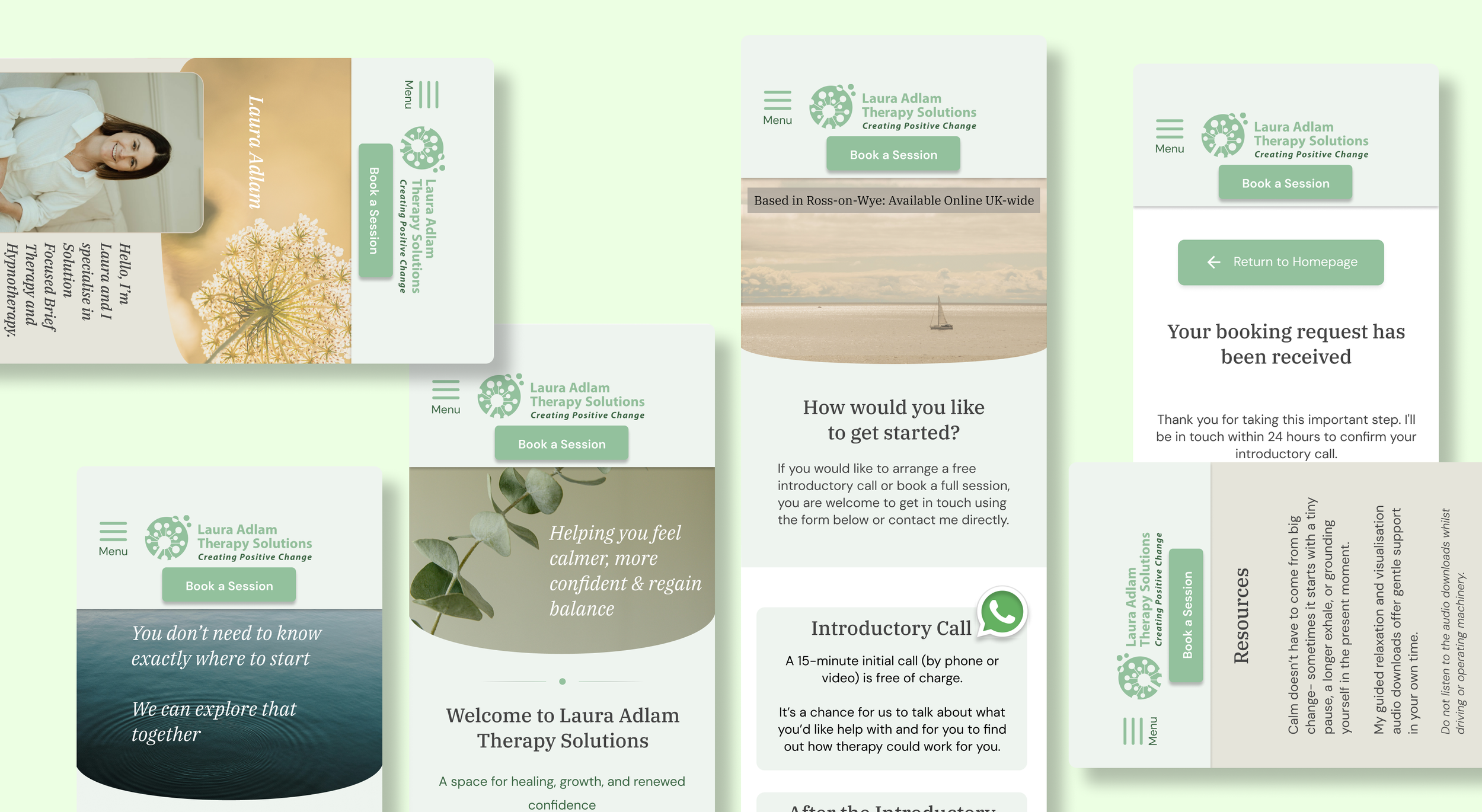
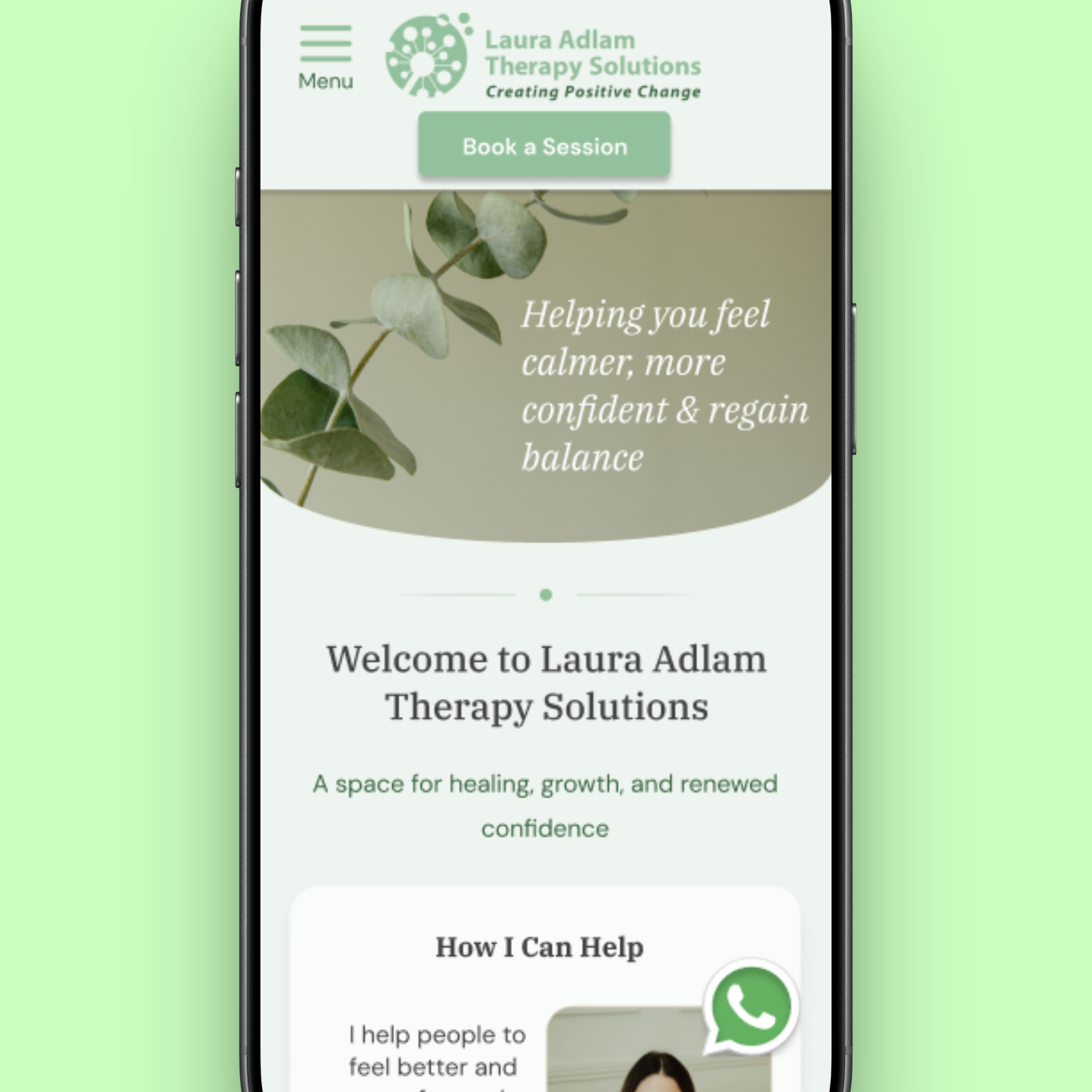
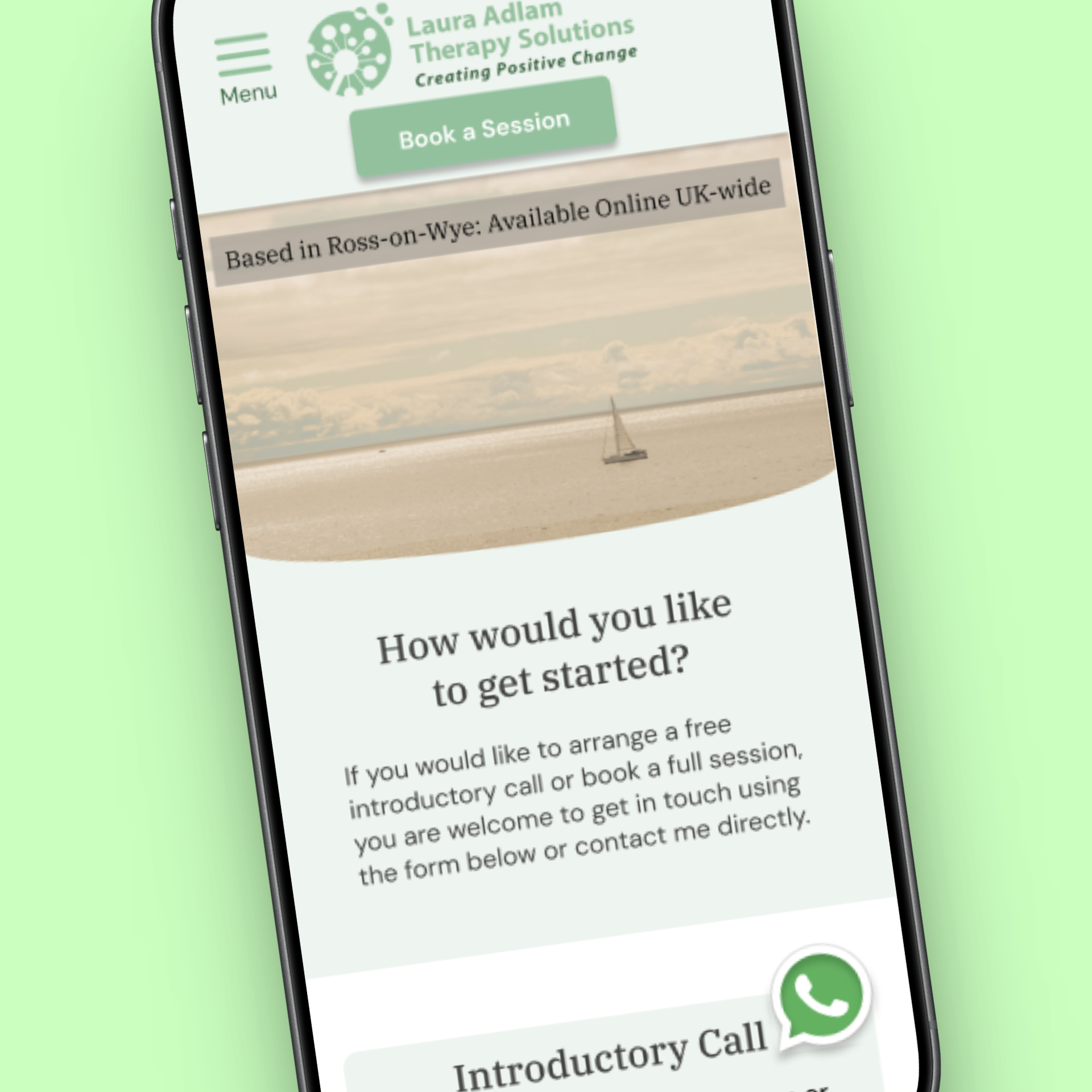
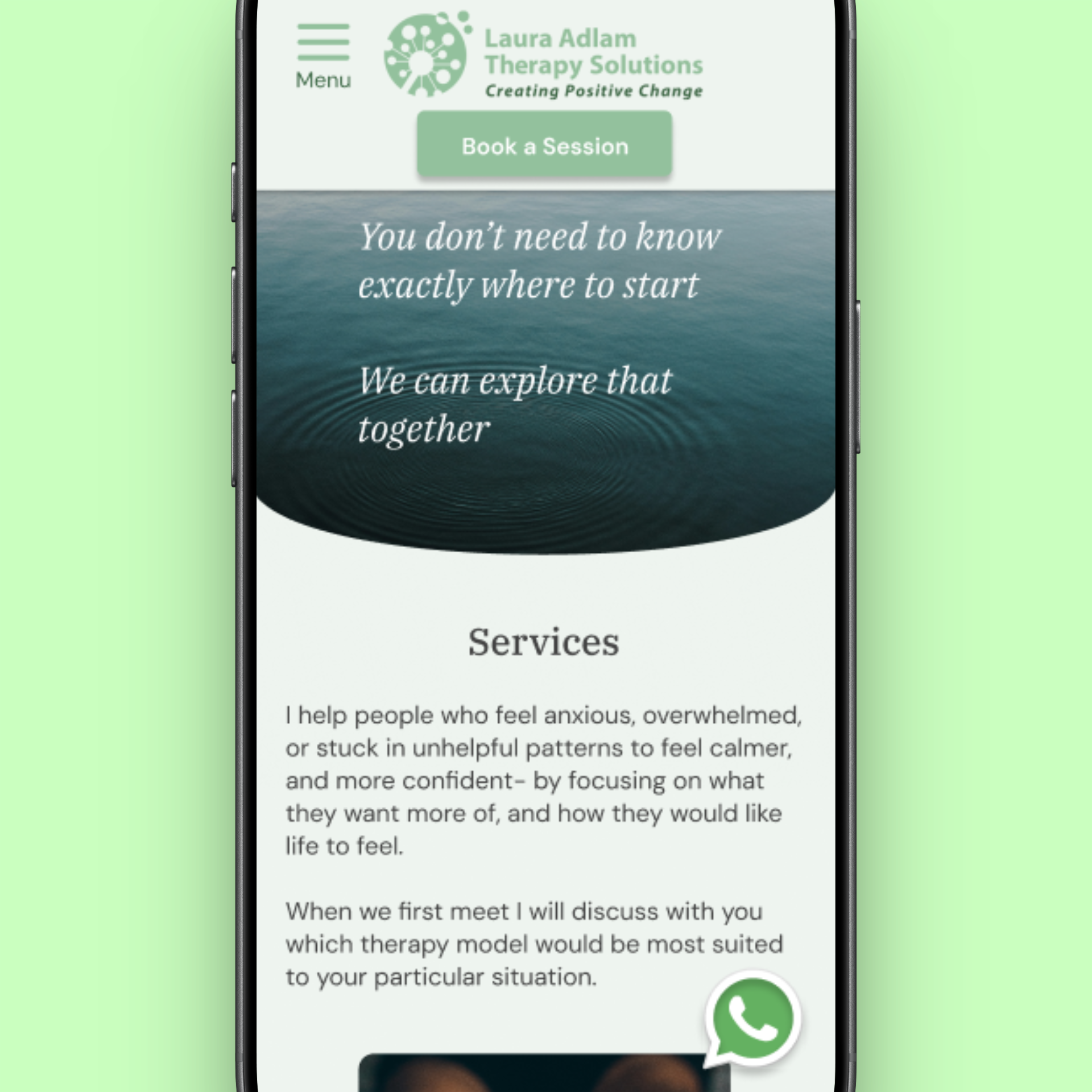
Lo-Fi Wireframes
Low-fidelity wireframes focused on restructuring information to reduce overwhelm. The aim was to test whether users could quickly understand what Laura offers, feel reassured, and identify how to get in touch without reading everything.
A mobile-first design approach was taken due to the majority of users stating during research that they tend to access the website on their phones. Designs were also adapted to different screen sizes.
Visual design was intentionally minimal to prioritise structure and flow.
The Brand
The client wanted the colours of the logo to remain as the theme throughout the website.
The goal of building Laura’s brand was to maintain both the brand identity, while also creating a calming and reassuring atmosphere. The original website used very little colour and felt almost clinical. Through choosing walm colours that complimented Laura’s logo, it provided a more modern and welcoming tone.
Design Foundations
As part of Laura’s rebranding, a strategic emphasis was placed on strengthening her social media presence. In collaboration with her content creator, we defined a set of core themes and visual design elements to ensure a cohesive and recognisable brand identity:
Uplifting, optimistic messaging
A consistent and thoughtfully curated colour palette
A typographic system pairing sans serif fonts for body text with serif fonts for headings
Usability Test
Validating Clarity and Booking Confidence
Usability testing was conducted using a mid to high fidelity mock-up to evaluate whether changes to structure, readability, and booking flow helped users move more confidently toward contacting Laura.
An unmoderated usability study was run with five UK-based participants. Each participant was asked to locate key information such as services offered, pricing, and how to book, then complete a booking-related task independently. Sessions concluded with a short questionnaire reflecting on clarity, confidence, and friction points.
Testing focused on time on task, ability to identify pricing and services, and successful completion of the booking flow without assistance.
Key Findings
Participants were generally able to navigate the site and complete tasks, but testing surfaced specific opportunities to further reduce friction and hesitation before booking.
Users wanted quicker access to contact options without having to commit to a full form.
Some users preferred direct messaging rather than structured booking flows.
Homepage information was clearer, but resources competed for attention, causing confusion in user journey flow.
Returning users wanted flexibility rather than a single prescribed path.
These insights reinforced that users approach therapy booking with different levels of readiness and emotional energy.
Iteration After Usability Testing
Based on testing insights, the design evolved to better support multiple entry points and user preferences without increasing cognitive load.
Key changes included:
Adding a floating WhatsApp action button to support low effort contact
Moving resources to a dedicated page to reduce distraction during booking
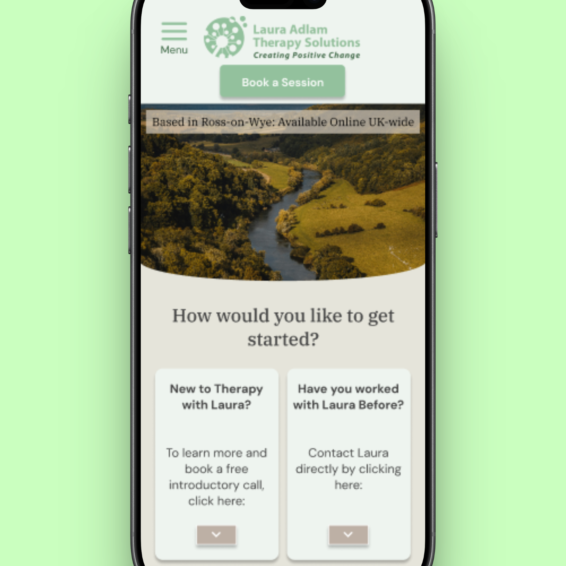
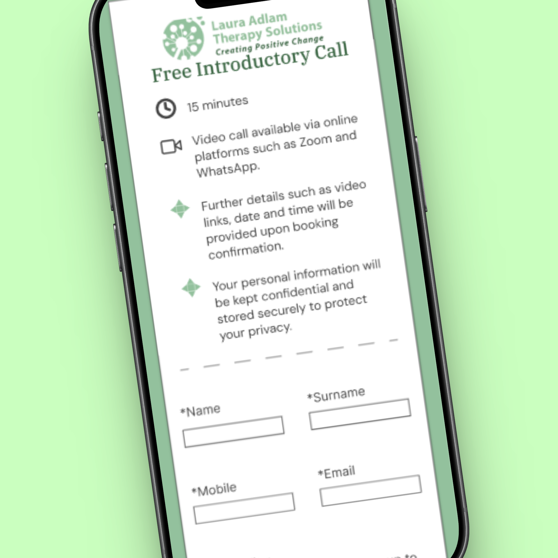
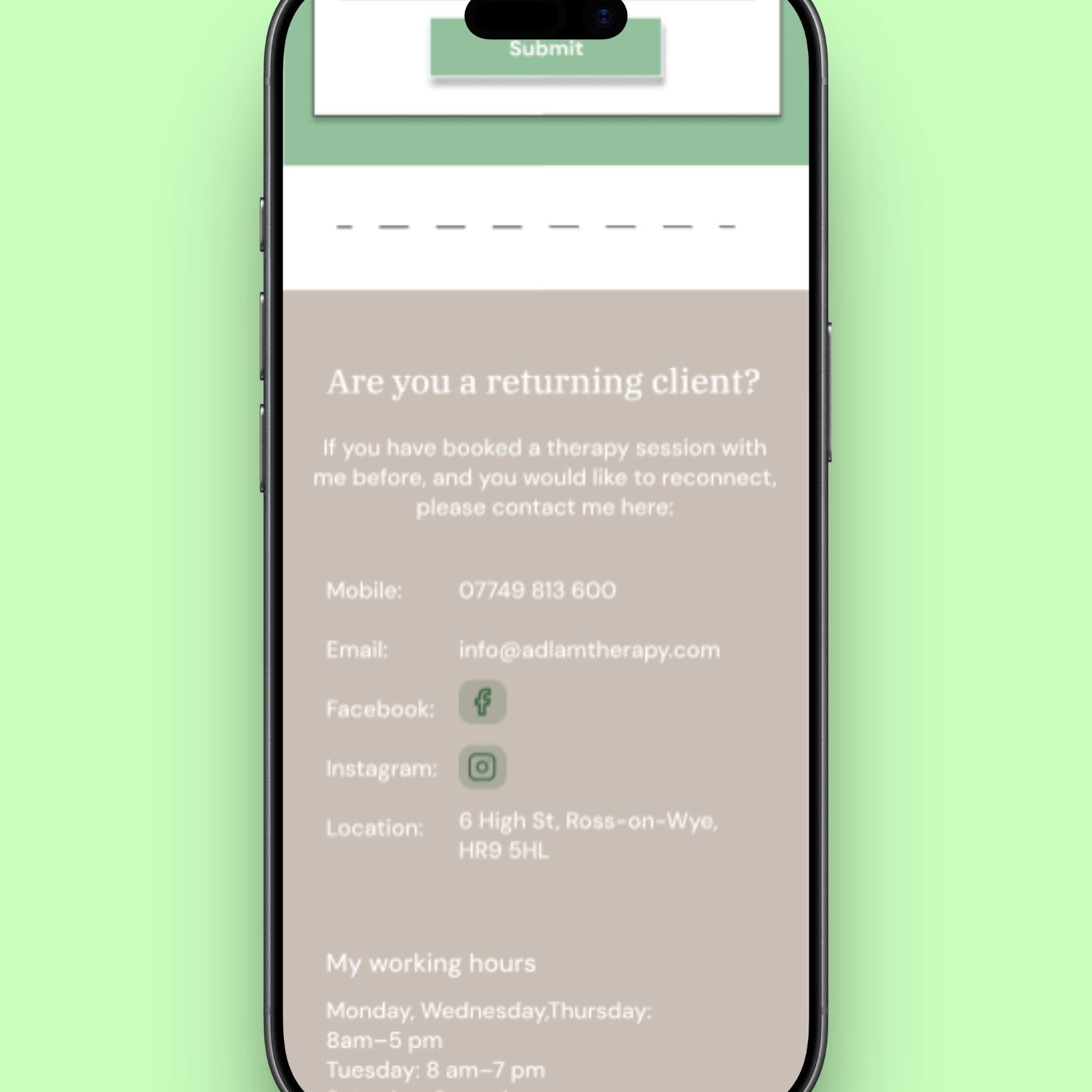
Reorganising the booking page so all users can choose between a form or direct contact
Clarifying that booking is optional and flexible, reducing perceived pressure
These changes aimed to support users who were ready to book, as well as those who needed reassurance before taking the next step.
Final Prototype
The final prototype supports users seeking therapy by balancing a calm, reassuring tone with clear structure and guidance.
It provides scannable service information, improved readability, clearer pricing cues, trust-building visuals, and a simple, low-stress way to contact Laura to book a session.
The design allows users to move from uncertainty to confidence at their own pace, without pressure or overwhelm, while supporting Laura’s goal of increasing genuine client enquiries following her rebrand.
Impact
Increased task completion rates through clearer navigation and improved information hierarchy
Reduced time to access key services, supporting faster user decision-making
Designed a more accessible and inclusive experience for a wide range of user needs