

Feedback Portal Dashboard
My Role
UX Research, UX/ UI Design
November 2024 - September 2025
Project Scope
End-to-end UX design project for a mobile-first feedback interface
Overview
A feedback portal designed for operations staff, technicians, project coordinators, team leads, and management teams working across international tennis tournaments. The product supports quick, guided feedback submission and transforms structured input into actionable insights for training, planning, and staffing decisions.
The Goal
Design a feedback system for teams travelling internationally and on-the-go that encourages honest, emotionally safe input while transforming fragmented, subjective responses into structured data that leadership can trust for fair decision making at scale.
The Problem
Feedback was being collected through shared Google Sheets, resulting in inconsistent, vague, and emotionally cautious entries that were difficult to analyse, compare, or trust, especially at scale.
Original feedback system
Understanding the User
Research Goal
To understand users’ frustrations with the current Google Sheets feedback system, including what feels confusing, inefficient, or limiting, in order to identify opportunities to design a more intuitive and supportive feedback experience.
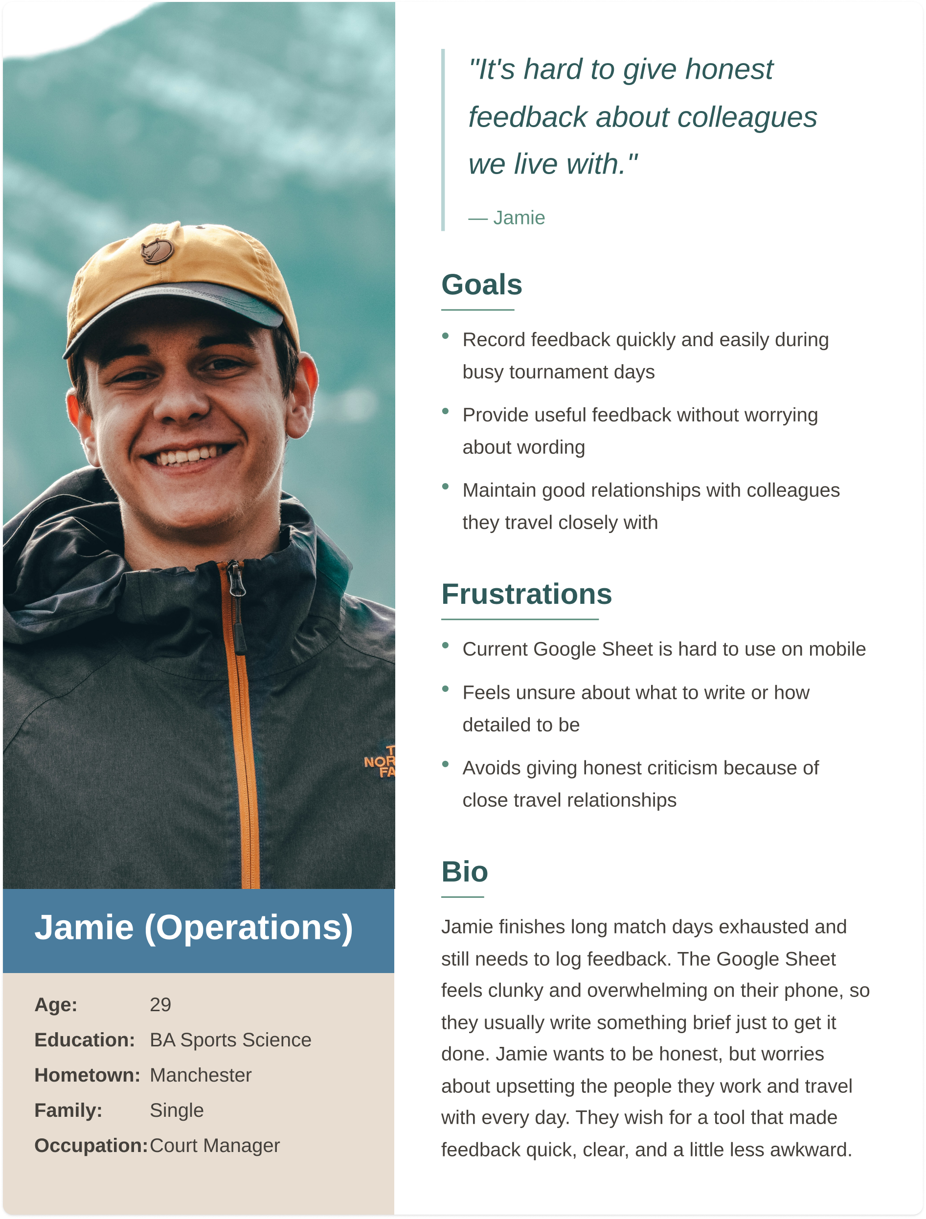
Group #1: Operations
Operations and new staff work long hours in high-pressure environments, so they need mobile-friendly, quick, and clear event-specific feedback.
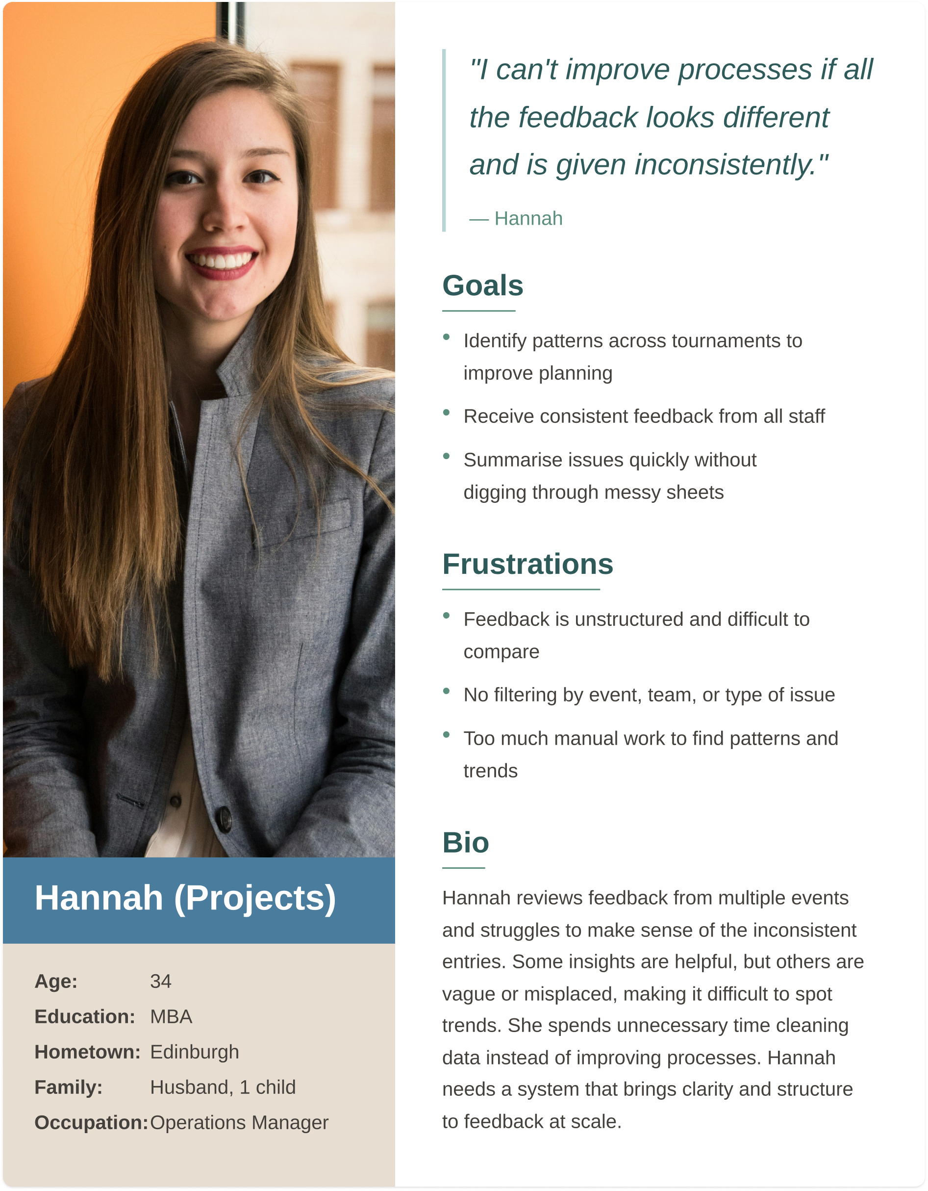
Group #2: Projects
Projects staff oversee multiple tournaments, so they need structured, high-level feedback showing trends and supporting process, planning, and communication improvements.
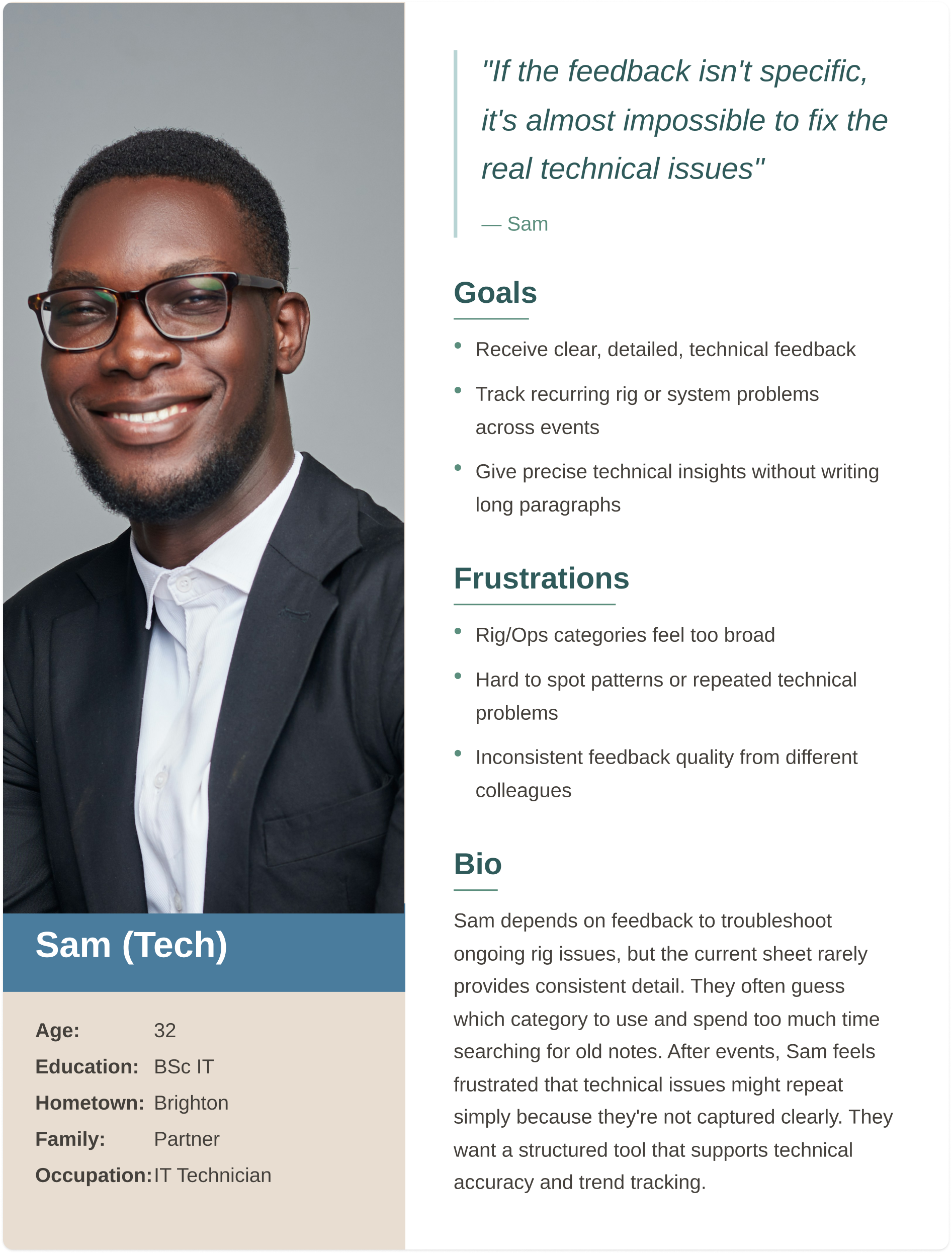
Group #3: Technical
Technical staff who who troubleshoot and maintain systems under time pressure, so they need clear technical feedback with categorized issues and visibility of performance across events.
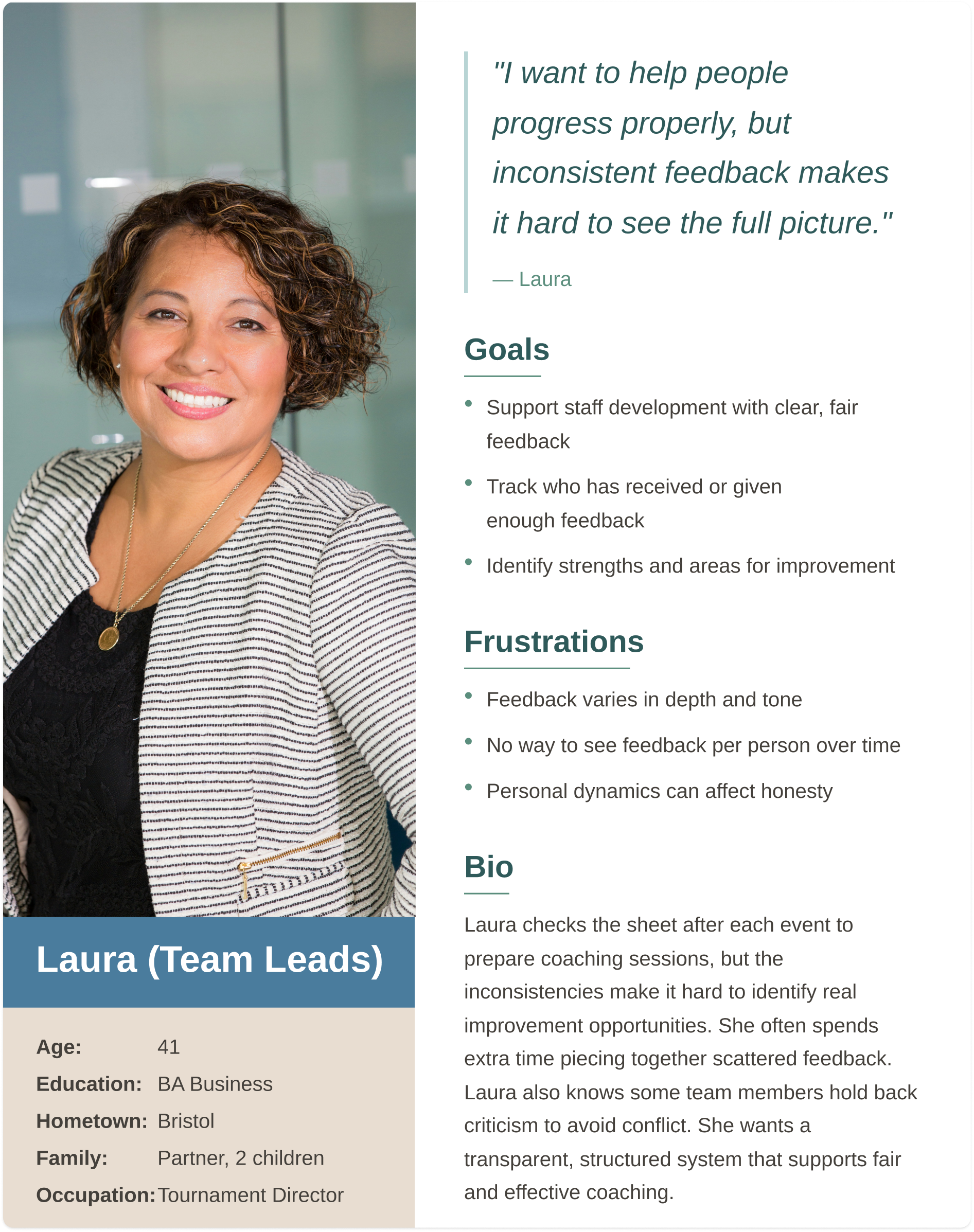
Group #4: Leadership
Leadership staff who provide much of the feedback and oversee staff development, so they need fair feedback, trend tracking, and options for private or public responses.
Research Experience Map
Key issues at each stage of the process
Giving Feedback
Rushed
Awkward
No Structure
Submitting
Fear of overwriting
Mobile issues
Reading Feedback
Too vague
Hard to interpret
Acting on Feedback
No follow-up
Lost insights
User research summary
I conducted qualitative and quantitative research through interviews with operations staff, technicians, project coordinators, and team leads. Initially, I assumed the main issue was form usability. Research revealed deeper challenges around emotional safety, time pressure, lack of structure, and the inability to use feedback meaningfully after submission.
“On my phone it’s almost unusable. I can’t see the columns properly.”
- Operator
“Prompts would make the feedback more consistent.”
- Technical Lead
What doesn’t work
Poor mobile experience
No consistency
Hard to analyse
Risk of overwriting
Limited psychological safety
What Works Well
Easy Access
Shared Location
Familiar tool
Anonymity Preference
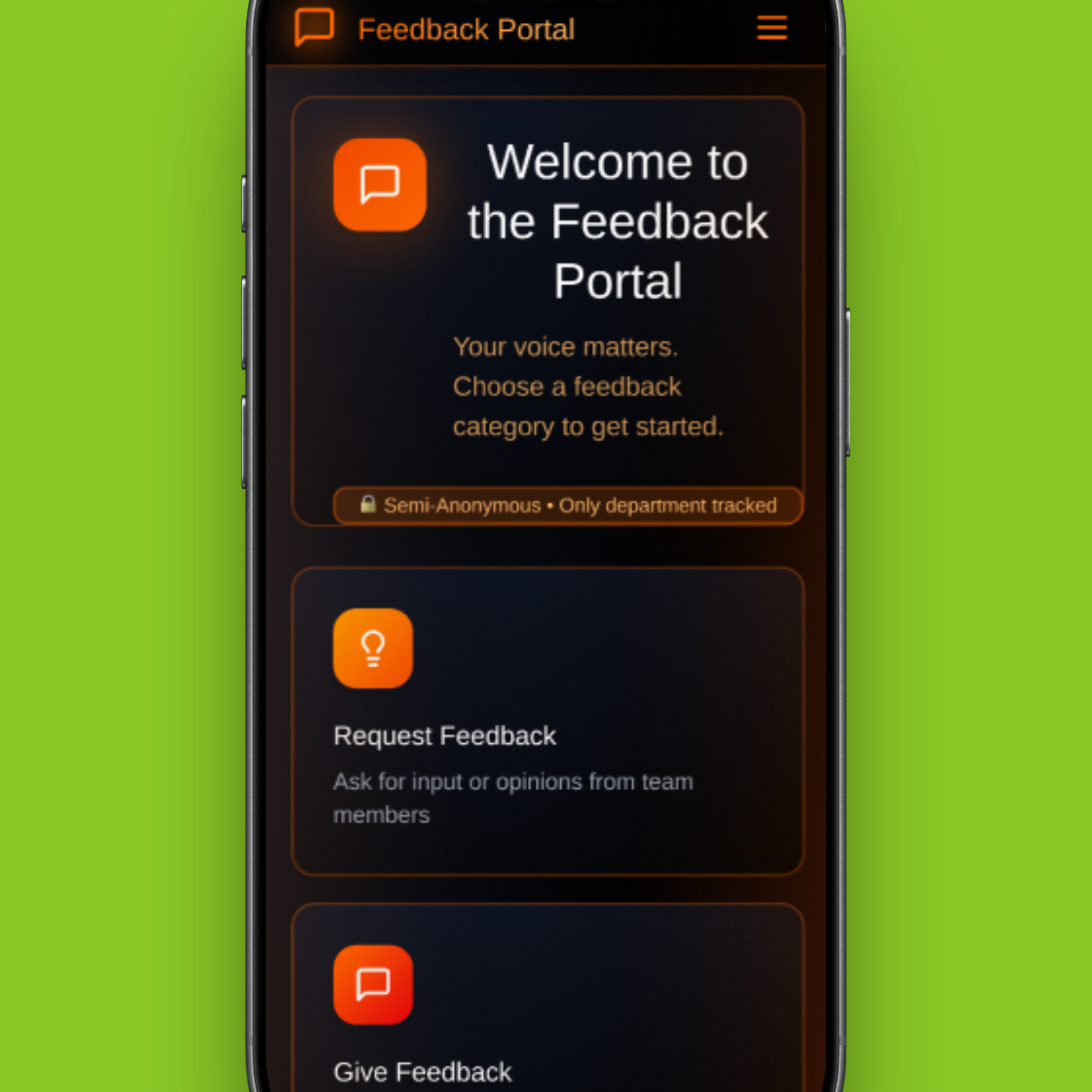
The current system works because it’s familiar and easy to access, but breaks down in practice due to poor mobile usability, inconsistent input, and limited psychological safety.
Research showed a clear preference for semi-anonymous feedback, balancing honest participation with enough context to make feedback useful.
“We travel together for months, it’s awkward writing critical feedback about friends.”
- Operator
“Semi-anonymous would be ideal, like showing role, not name.”
- Project Lead
Personas
Pain Points
Giving honest feedback feels emotionally risky and leads to vague submissions.
Time and fatigue make long form feedback unrealistic.
Broad categories create overlap and inconsistency.
Leadership cannot identify trends or compare performance reliably.
Ideation
Affinity Diagram
Affinity diagramming revealed that the core issues centred on the feedback submission experience being time-consuming, inconsistent, and difficult to interpret. Users struggled to provide clear, useful input and to identify patterns such as training needs. These insights informed the introduction of structured prompts and clearer guidance to improve the quality, consistency, and usability of feedback.
Site map and simple navigation for users to give and receive feddback
User flow for internal feedback submission and engagement
Lo-fi Wireframes: Validating Core Feedback Submission
At this stage, the focus was on validating the core feedback submission experience for frontline staff. Low-fidelity wireframes were used to test whether users could quickly and confidently submit feedback in realistic, time-constrained environments.
These wireframes intentionally prioritised structure, flow, and content hierarchy over visual design to ensure the fundamentals worked before investing in a polished design.
Usability Testing
Testing Assumptions in Context
Usability testing was conducted using an early mockup to evaluate clarity, speed, and confidence during feedback submission.
While participants were able to complete tasks successfully, testing revealed broader questions about what happened after feedback was submitted and how it was used.
Key Insights
Feedback as a System, Not a Form
Testing highlighted that the feedback experience did not end at submission. Participants raised concerns around visibility, trust, and decision-making:
Contributors wanted confidence that feedback was reviewed and acted upon
Managers relied on the same data for performance evaluation, promotions and planning
Inconsistent entries made comparison and trend analysis difficult
This reframed the problem from improving a single flow to designing a feedback system that supported multiple roles.
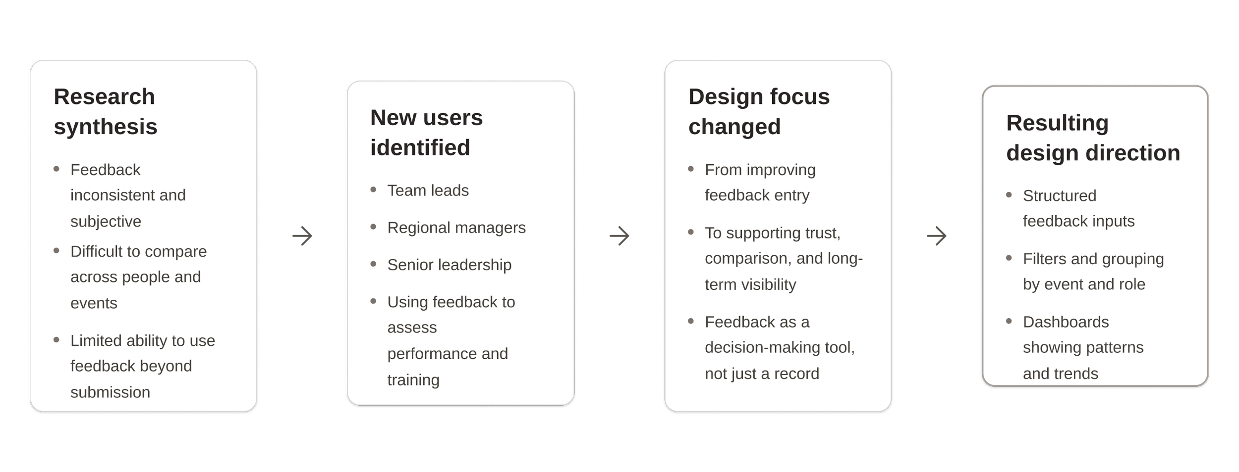
Iteration Including Management
Early synthesis showed the system wasn’t just failing contributors, but also those using feedback to make decisions. Expanding research to include management revealed that inconsistent, subjective input made performance assessment and comparison unreliable. This shifted the focus from improving submission alone to designing a system that supports high-level analysis and fair decision making, leading to the introduction of dashboards, filters, and trend-based insights.
Research Validation with Management
As testing progressed, our understanding of the problem expanded beyond submitting feedback to how that feedback is reviewed, compared, and used over time. I conducted follow-up research with team leads and managers to understand how feedback was used beyond submission.
“We get a lot of feedback, but it’s hard to compare performance across events.”
-Team Lead
“I need to see patterns over time, not just individual comments.”
-Manager
“Right now, feedback feels too subjective to base decisions on.”
-Senior Manager
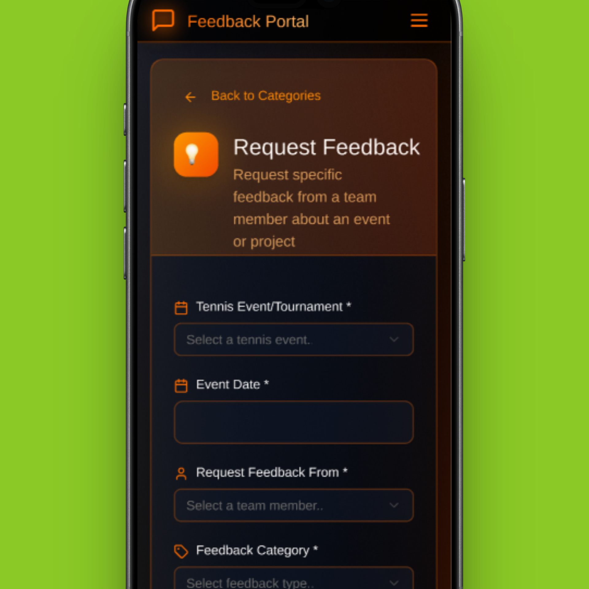
These insights informed the next iteration, where the interface expanded beyond feedback entry to include tools for reviewing, comparing, and acting on feedback through a dashboard.
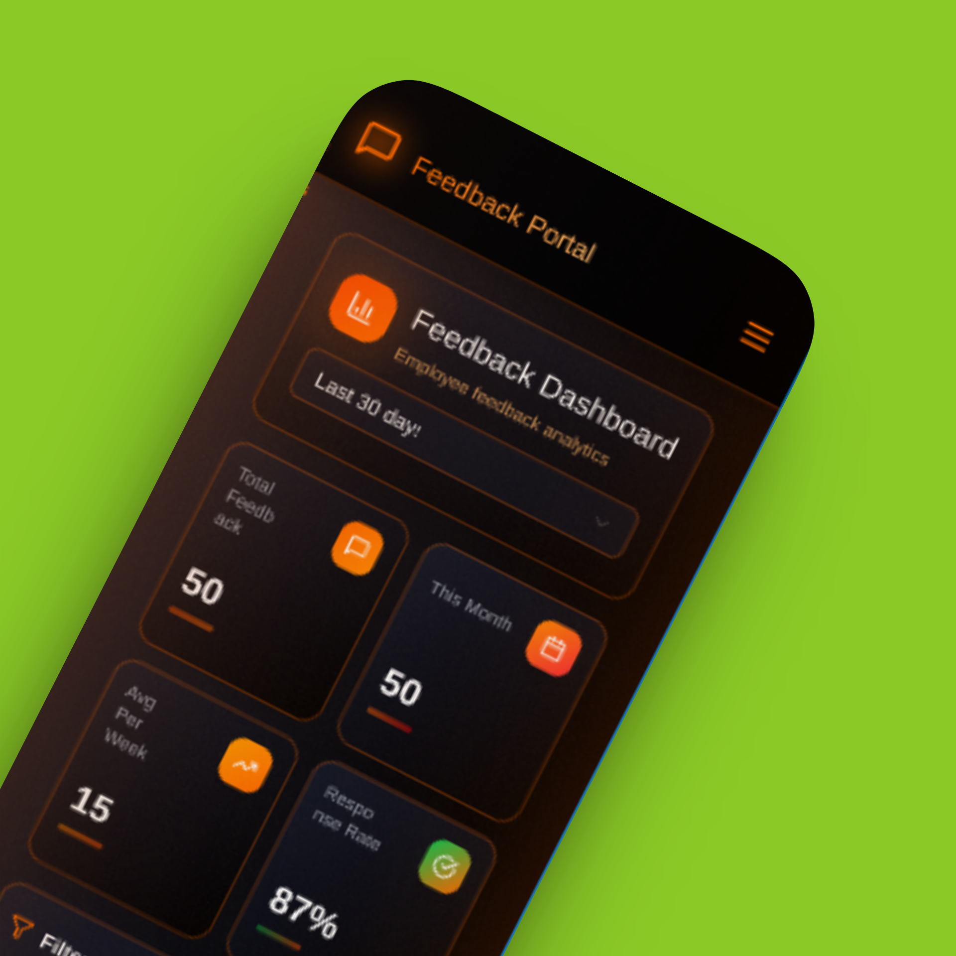
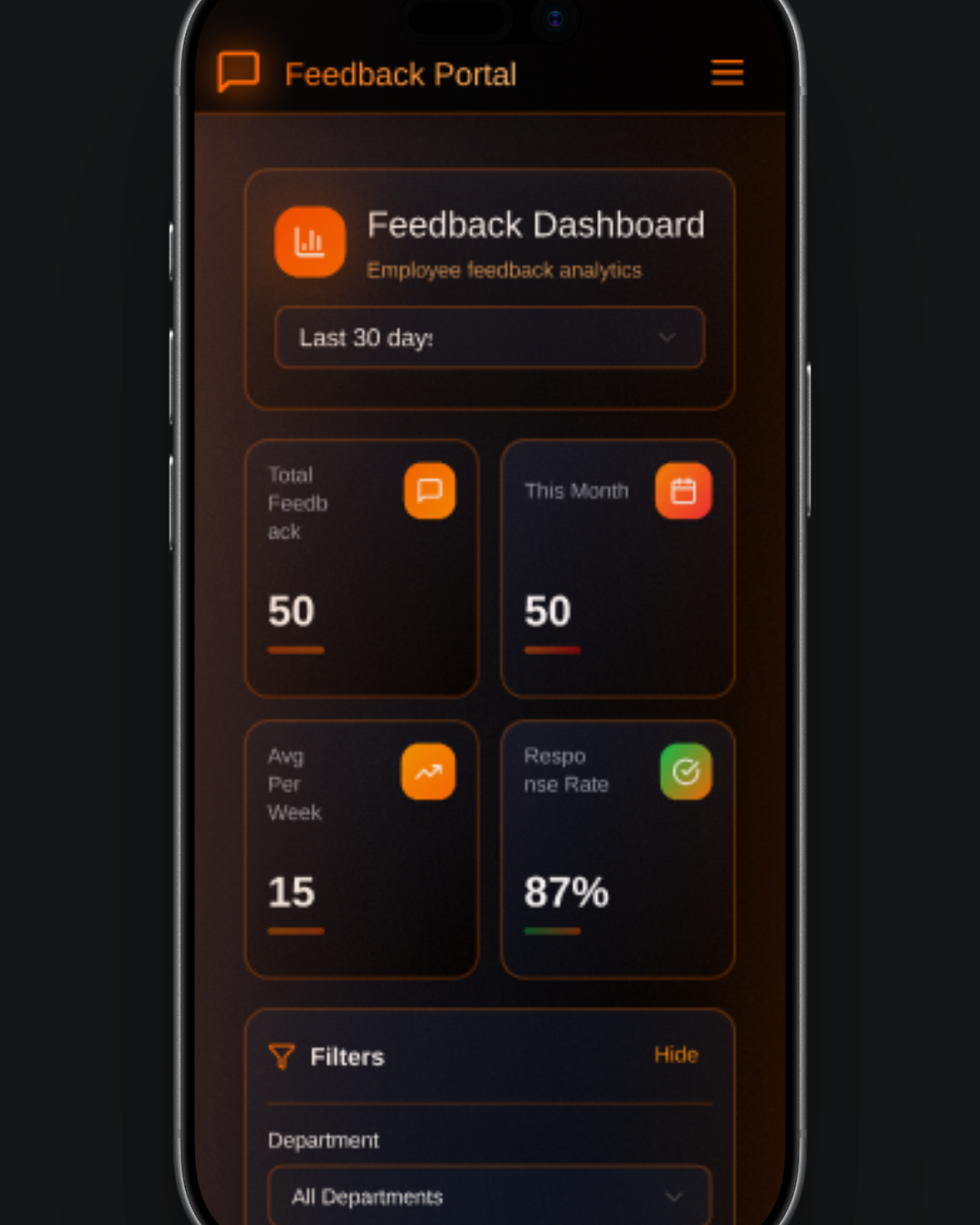
Dashboard iteration
Summary
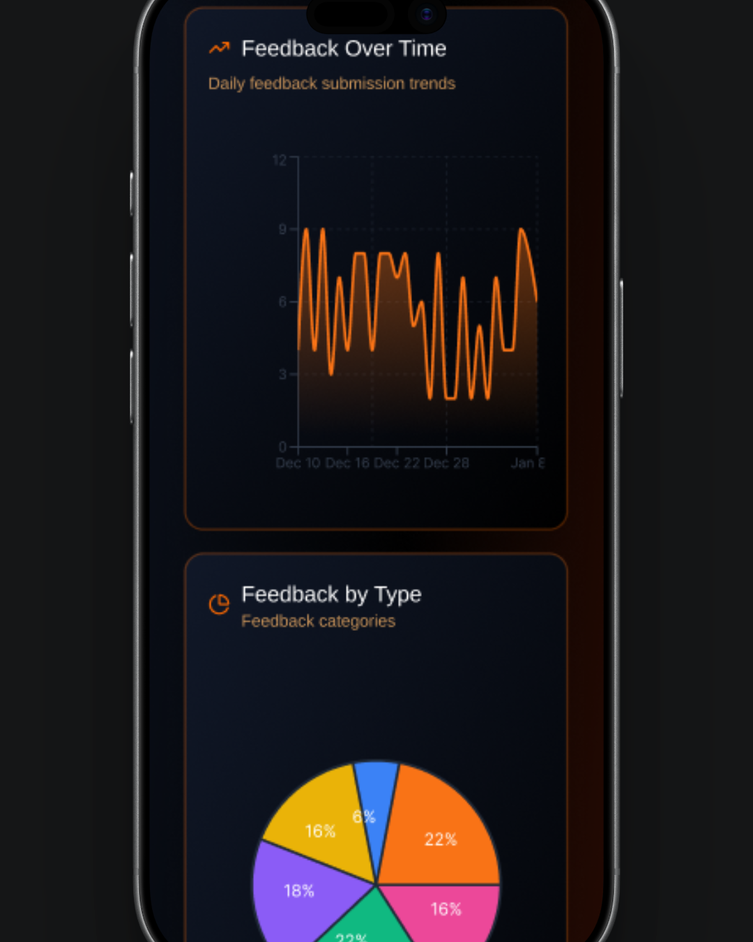
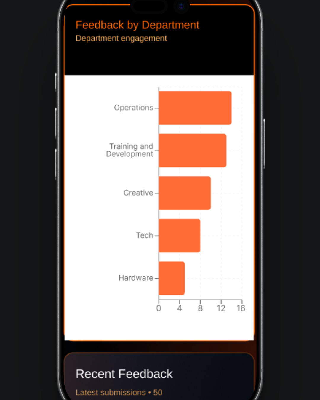
The dashboard component provides an interactive, data-driven overview of feedback activity, combining flexible filtering with clear visual insights in a responsive dark-themed interface. Users can explore trends over different time periods, drill down into specific data points, and view real-time submissions, all within a seamlessly connected system that updates dynamically based on selected filters.
Key features:
Time range controls: Switch between 7, 30, 90 days, or 1 year with instant updates
Stats overview cards: High-level metrics with clickable navigation to details
Advanced filtering: Filter by department, feedback type, and custom date ranges with reset option
Visual analytics: Line, pie, and bar charts with interactive click-to-filter functionality
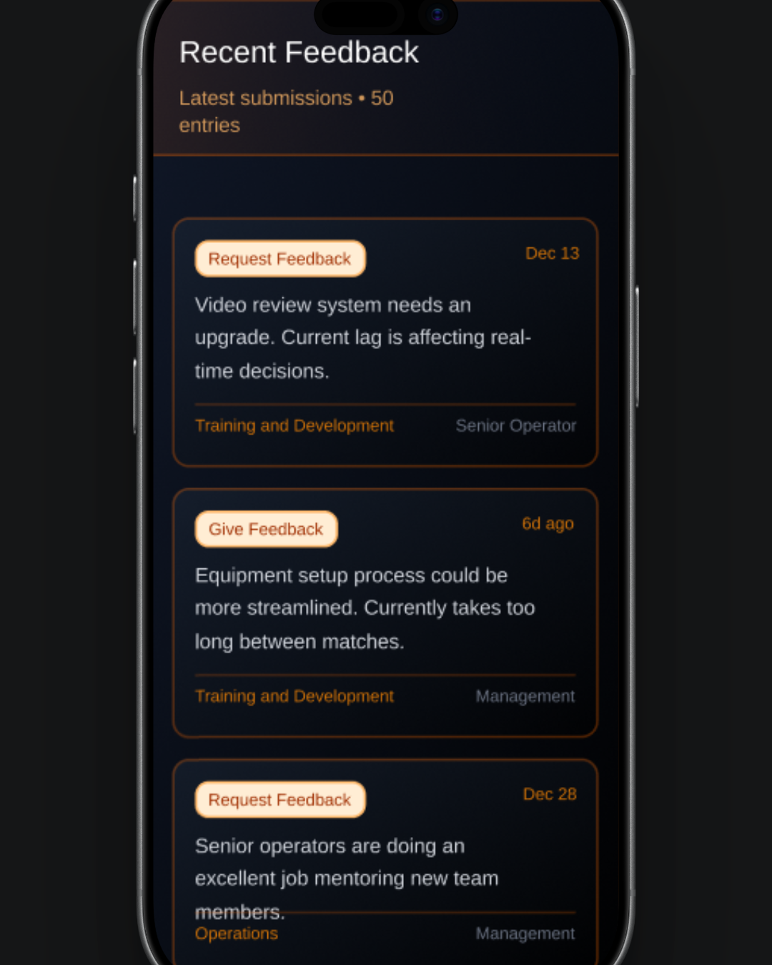
Recent feedback feed: Live updates with highlighted and filter-responsive entries
Responsive design: Optimized layouts for mobile and desktop with smooth transitions
The Brand
Iterations were made to the colour scheme to ensure consistency with the company’s brand.
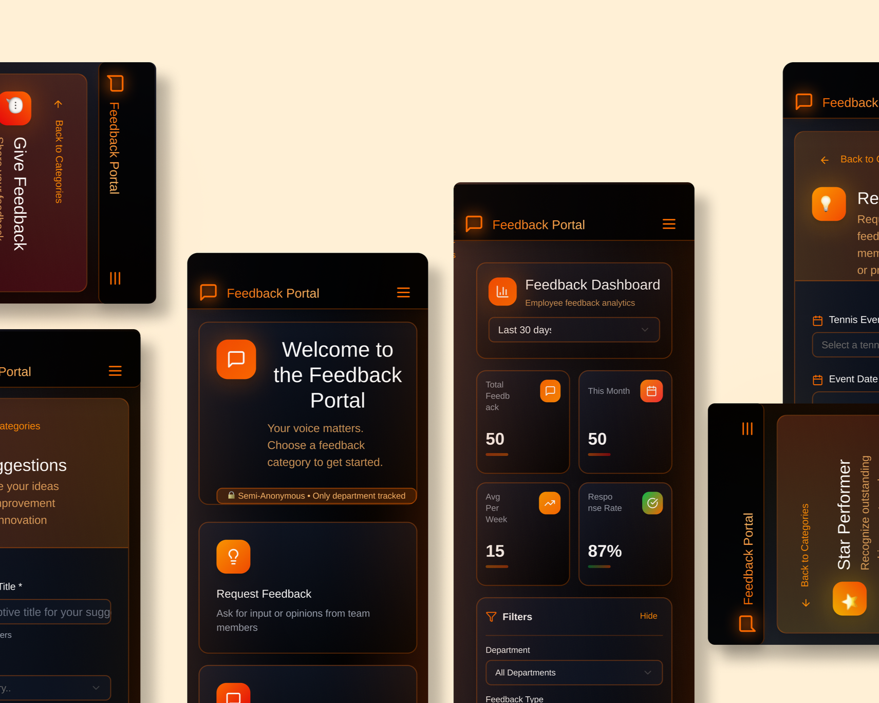
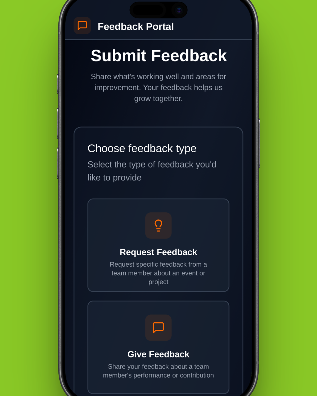
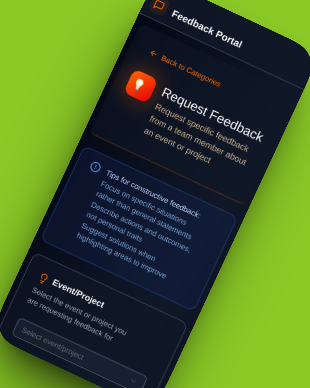
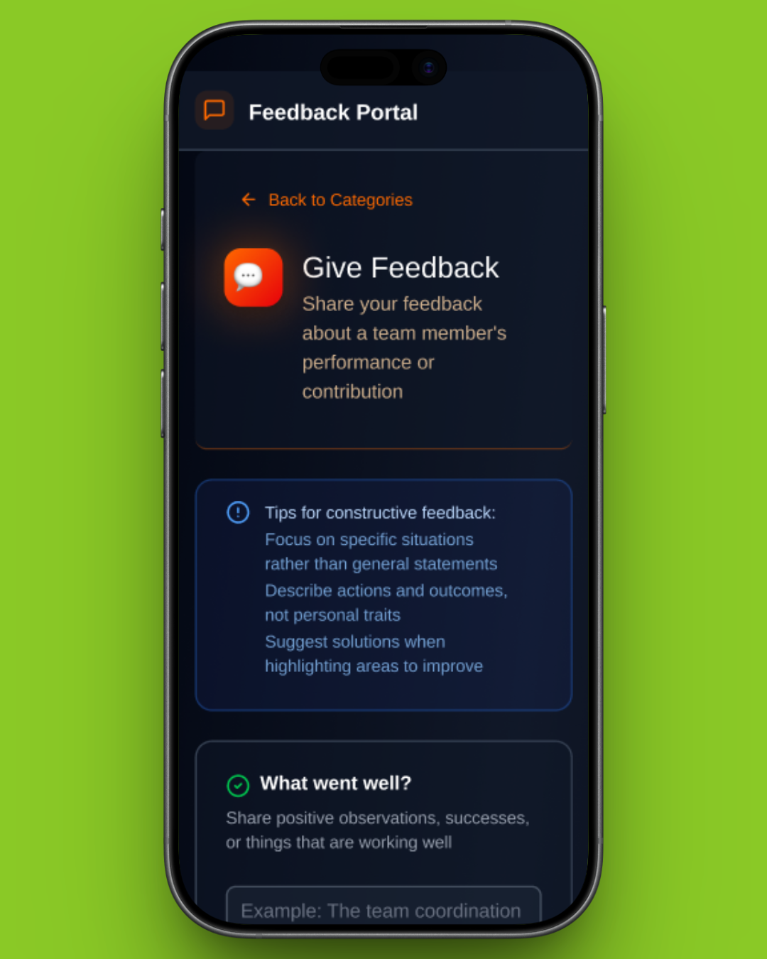
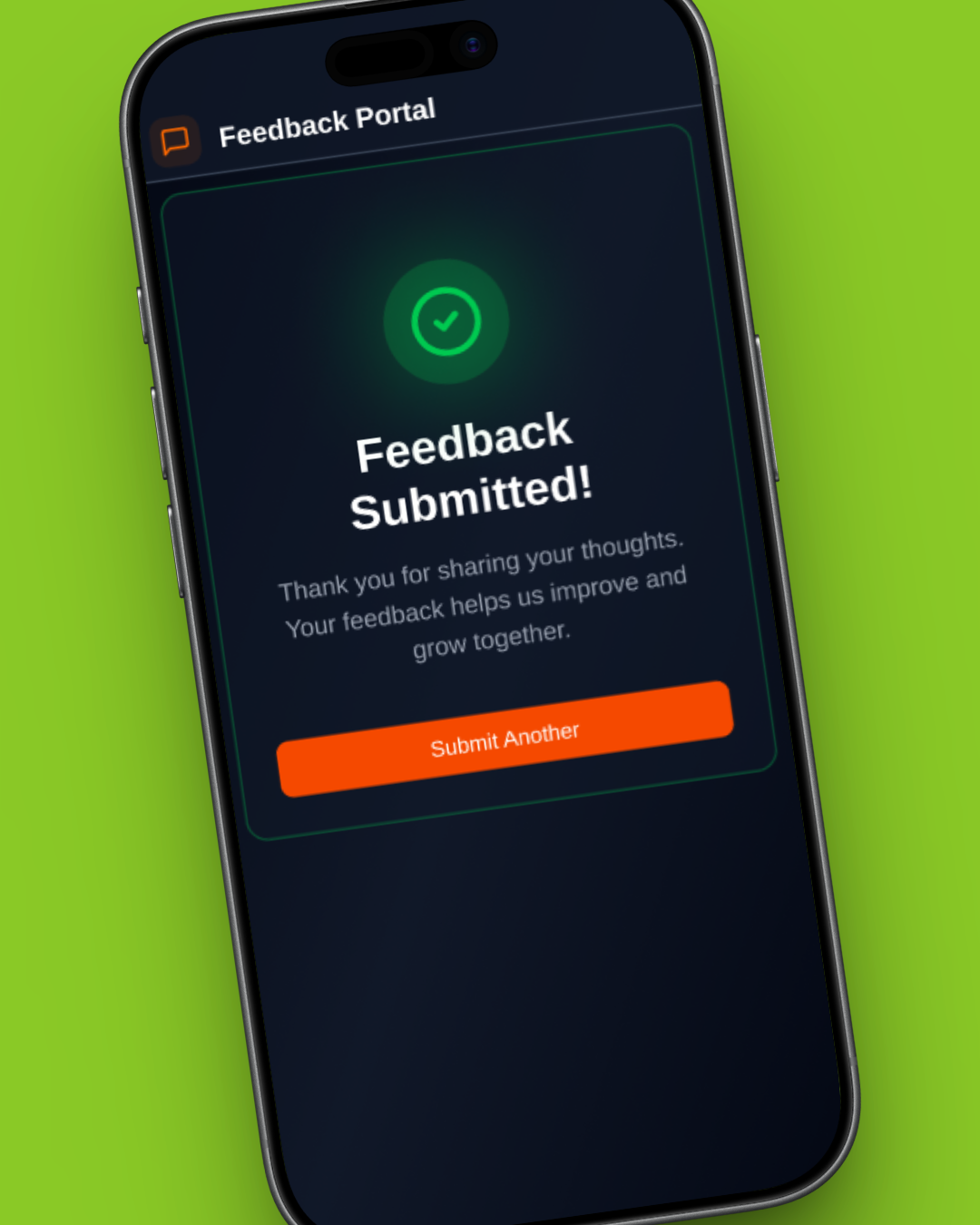
Final Prototype
The final prototype brings together insights from contributors and management, supporting both honest feedback submission and fair decision-making.
Expanded research shifted the design from a simple feedback form to a system that enables consistency, comparison, and trend analysis at scale.
A more consistent design kit was established to align with the company brand
Impact
The prototype demonstrates guided mobile feedback entry and a dashboard that surfaces patterns as well as raw comments to support confident decisions across teams and events. The key impacts include:
Reduced feedback submission steps by 30%, streamlining the overall process
Identified and resolved key friction points through user research and journey mapping
Improved clarity of communication, enabling more consistent and actionable feedback